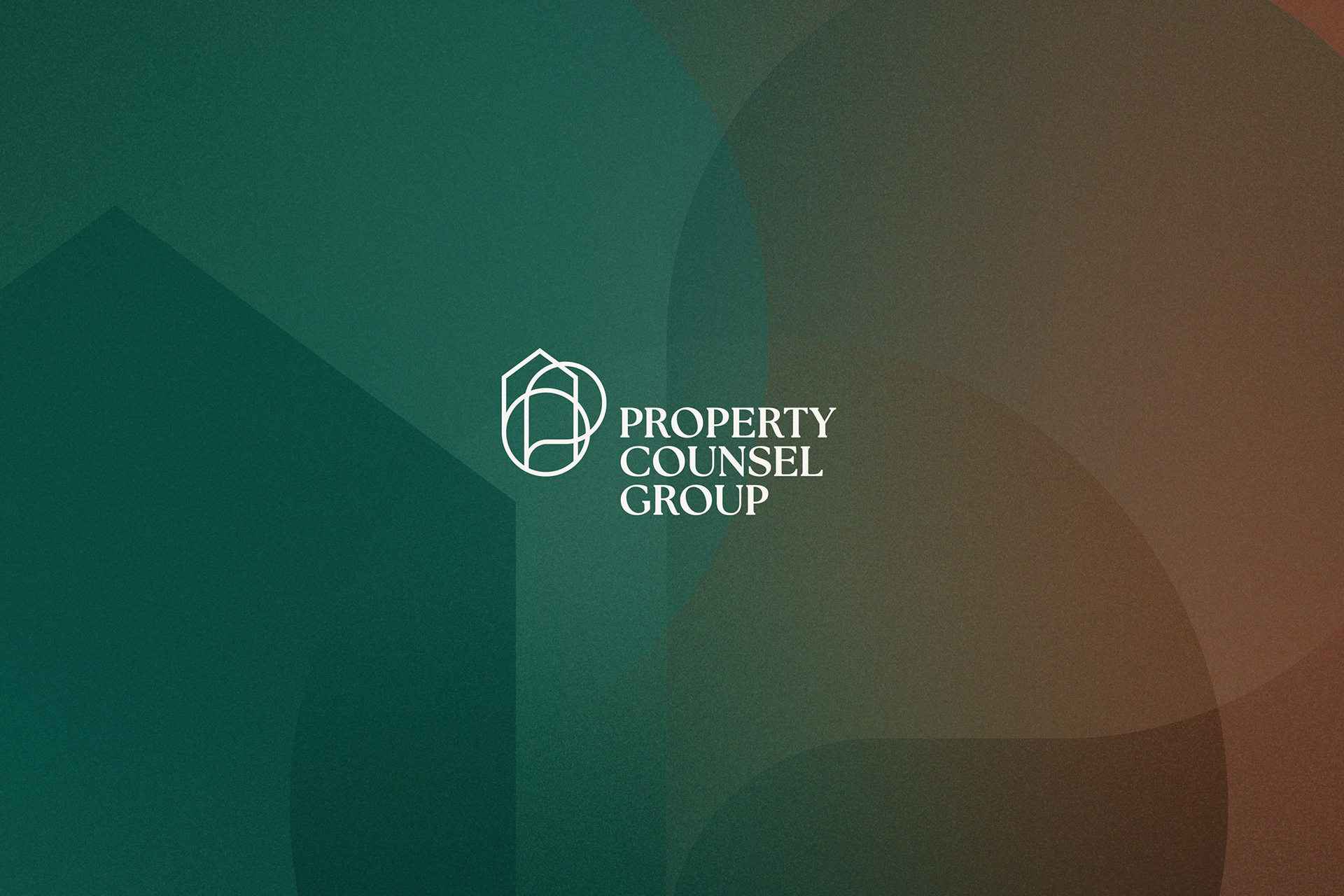
Property Counsel Group hired me to create a brand that was classic and well established, reflecting their expertise in property management, sales, marketing and legal counselling. With their skillset intertwining, I built their logo with overlapping symbology; a home (symbolising property), a speech bubble (counselling) and a circle (group). Look again, and you can see the company acronym; the letters P, C and G.
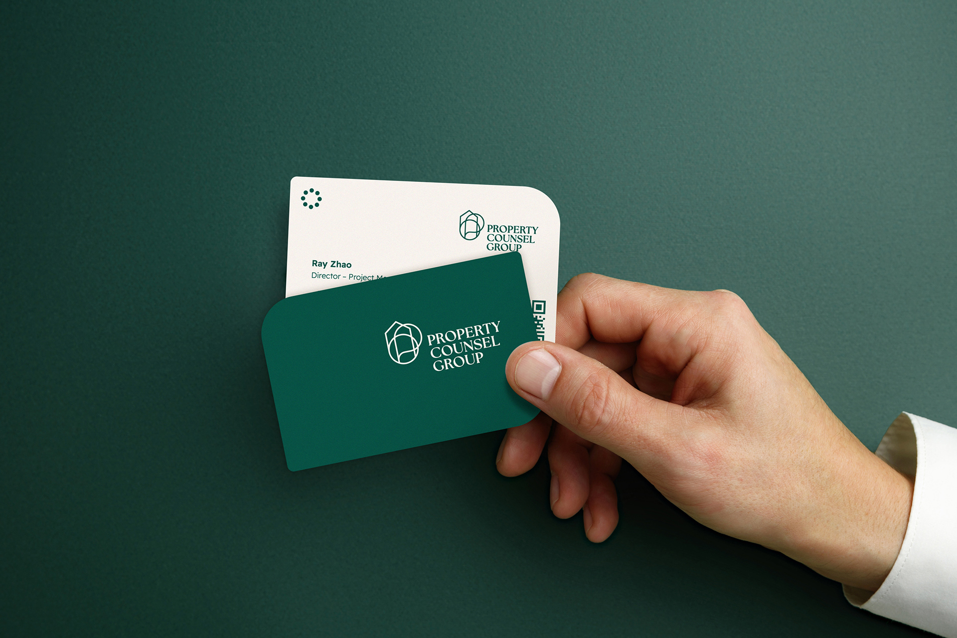
Their colour palette was also carefully considered. I picked a deep forest green, a rich brown leather tone and a light bone hue to reflect their down to earth roots and wisdom. Combined with a modern serif and an easy to read sans serif, they work in harmony to reflect maturity and clarity, as legal text & terms can be overwhelming to their clients. The pattern, stationery and style guide soon followed, giving Property Counsel Group pride and confidence in a highly competitive marketplace.