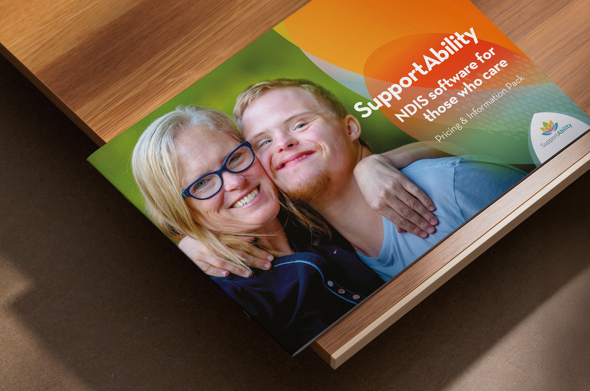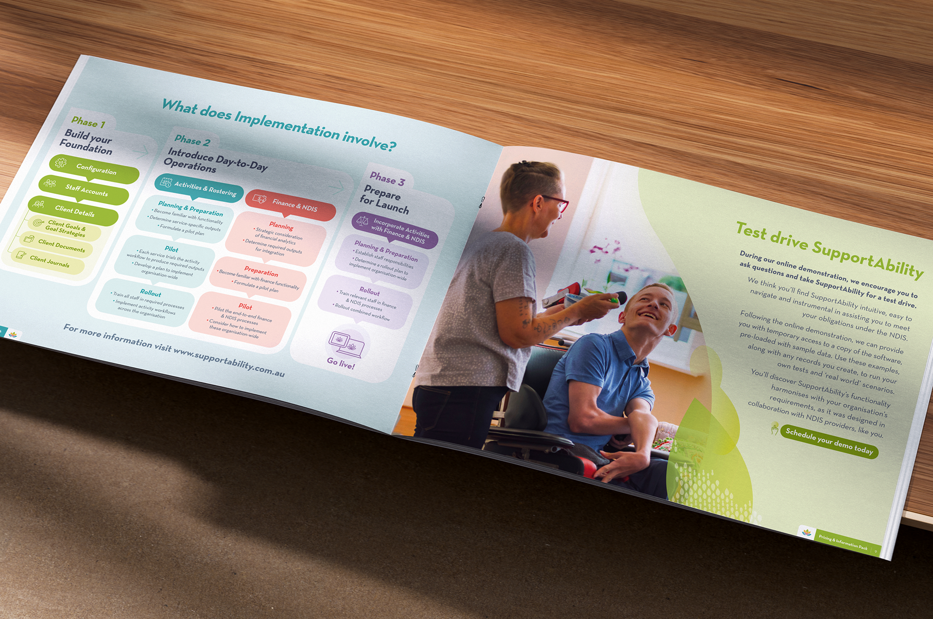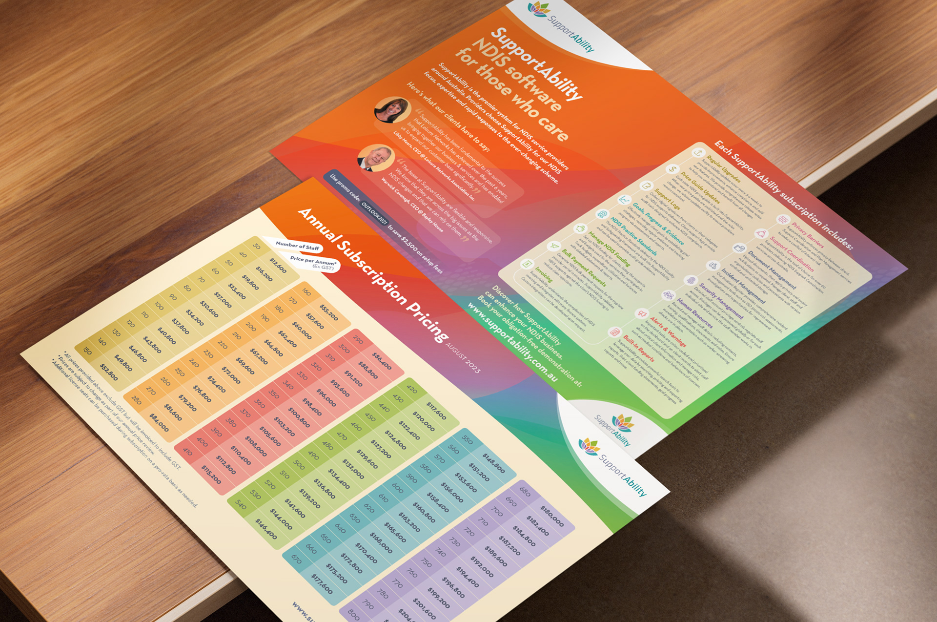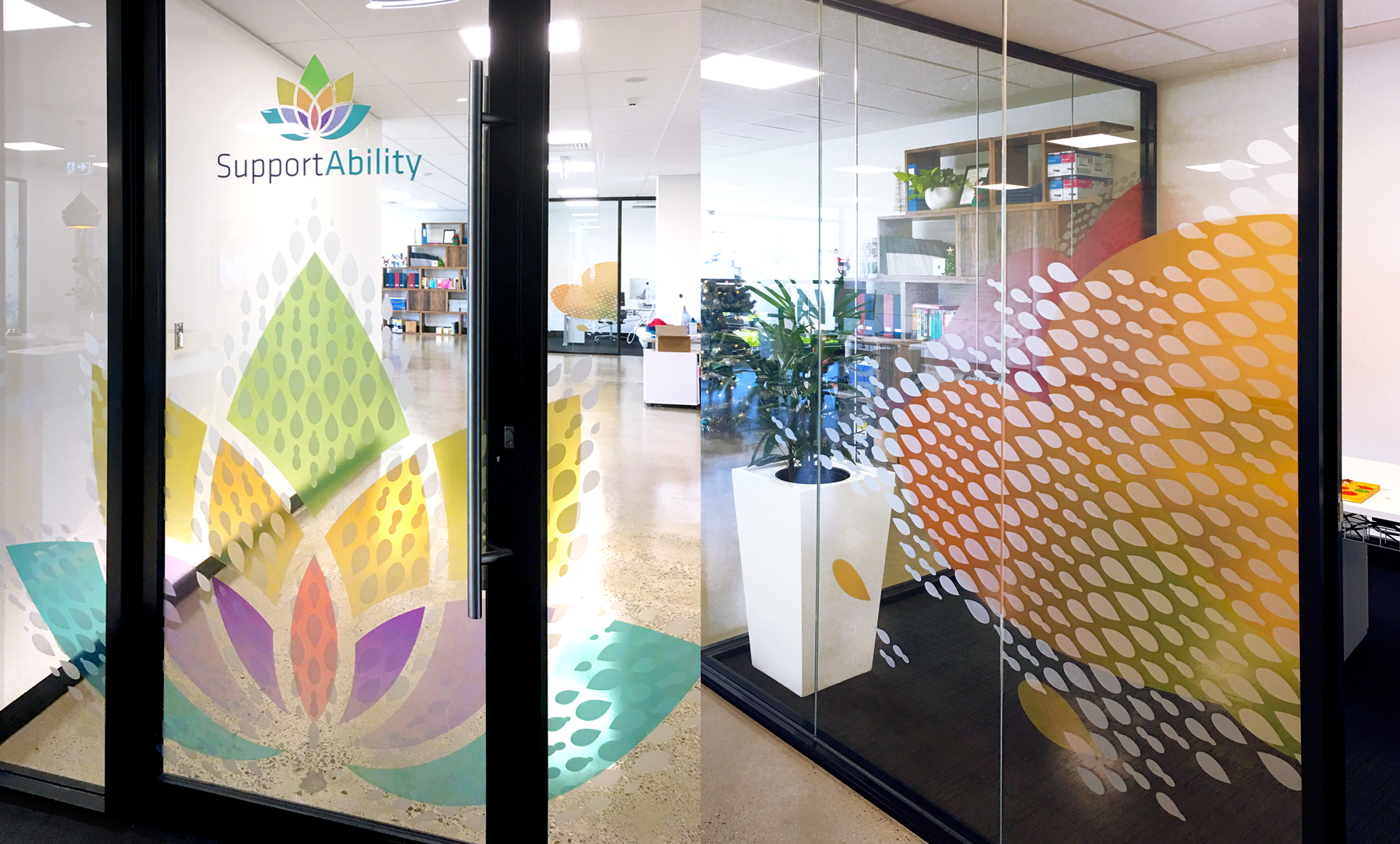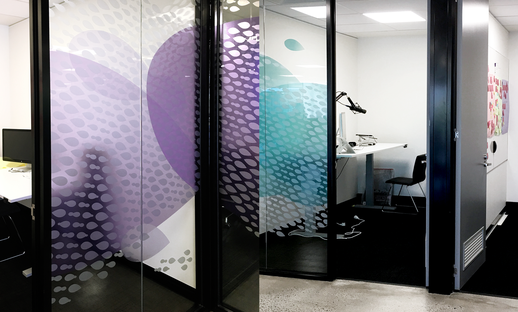
I created SupportAbility’s visual identity to consistently convey positivity, reliability, and warmth. Prospective customers need to know that they can trust this brand’s easy-to-use NDIS management software so that they can focus on providing quality care for their clients.
Across several pieces of collateral, orange acts as the hero, complemented by a palette of colours in matching hues. Happy imagery and san serif typography reinforce the brand’s overall approachable and friendly feel.
Projects:
– info pack booklet
– EDMs
– certificates
– stationery
– A4 flyers
– press ads
– conference stand
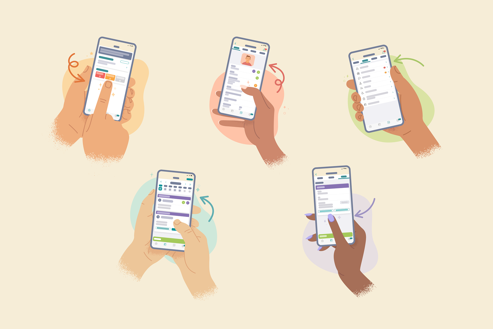
– fun illustrations demonstrating their easy to use app
– office glass decals